Rains Shanghai: A Study in Material Contrast
For Rains’ Shanghai store, we had one objective: define the new visual language of the brand through material tension and architectural rhythm. As the first space to showcase Rains’ updated identity, this project set the tone for what would follow—functional, futuristic, and unapologetically sharp.
Brief
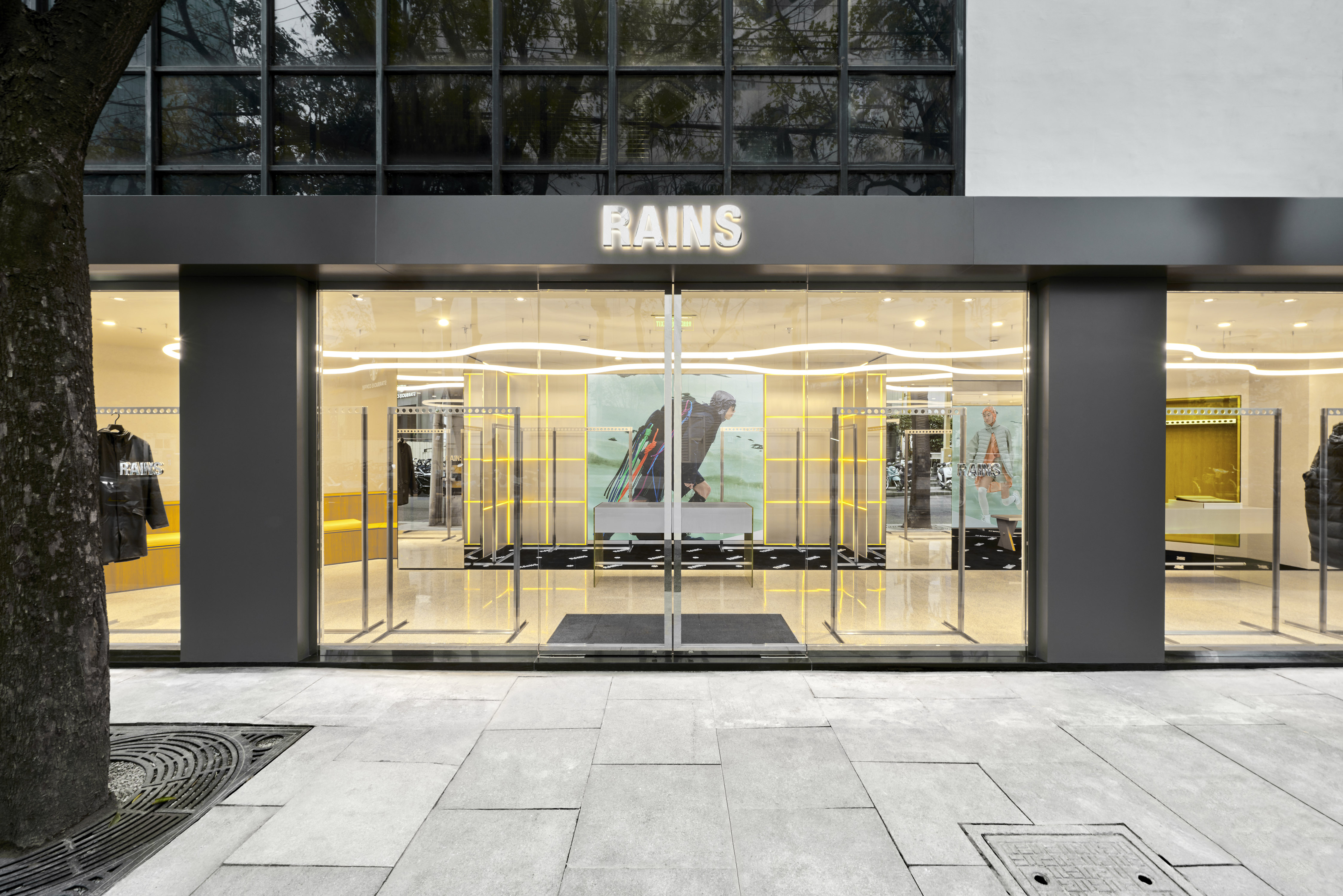
Located in one of the city’s most forward-facing districts, the Shanghai store had to feel grounded in utility, but elevated in execution: A material-first concept with minimal detailing and maximum impact. Strong, industrial references balanced with clean lines and control. An immersive retail space that reflects Rains’ evolution from gear to lifestyle.
Architecture & Design
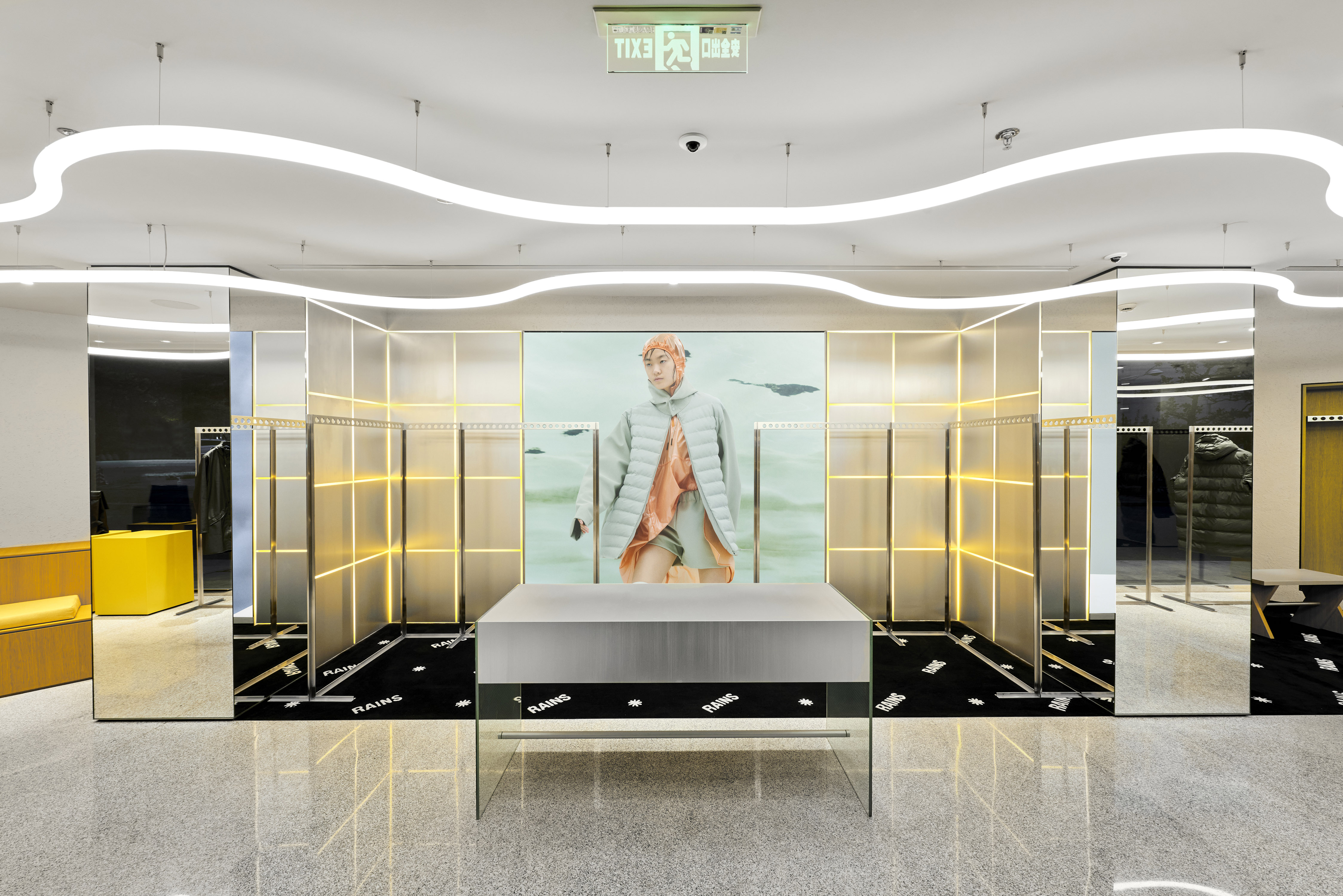
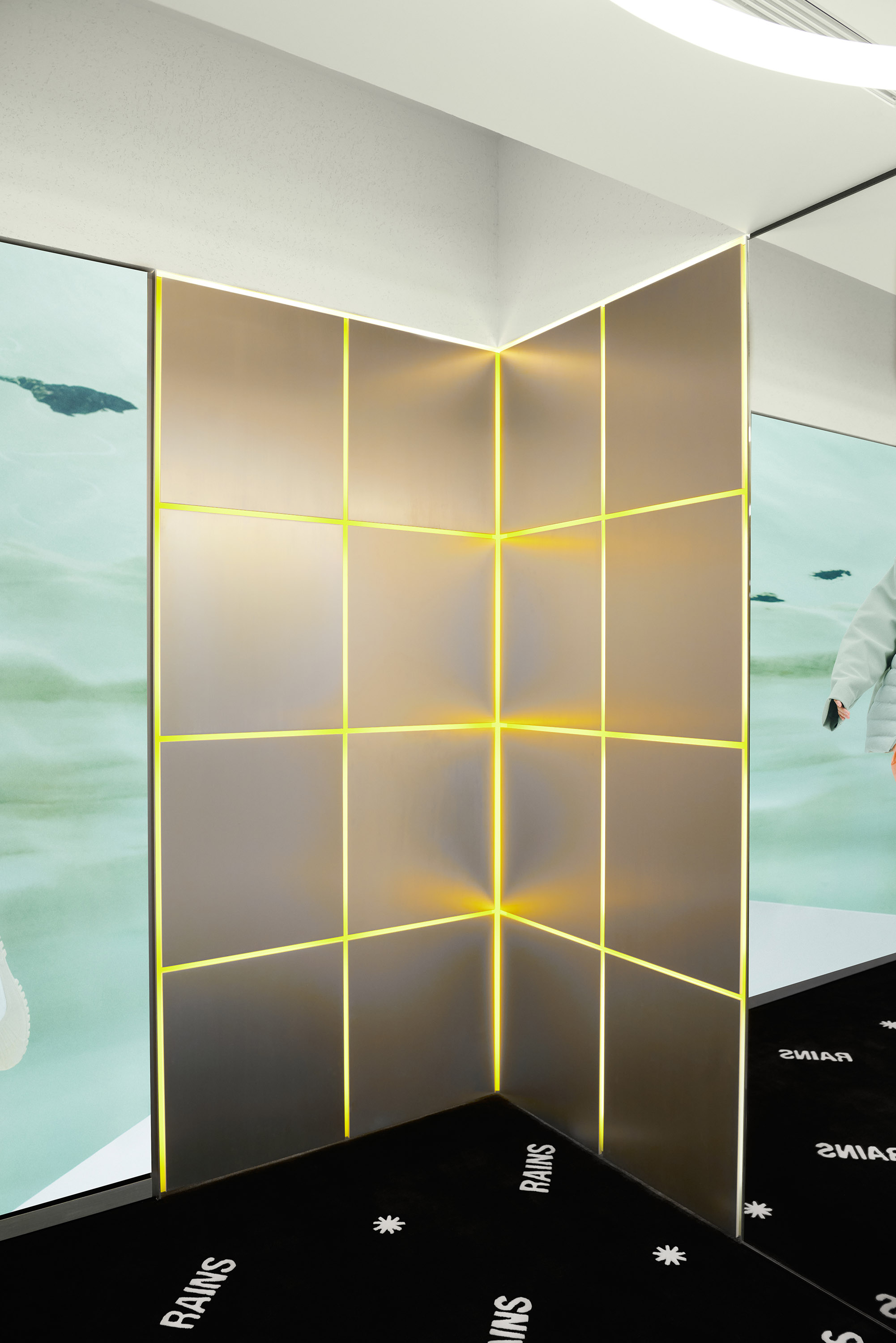
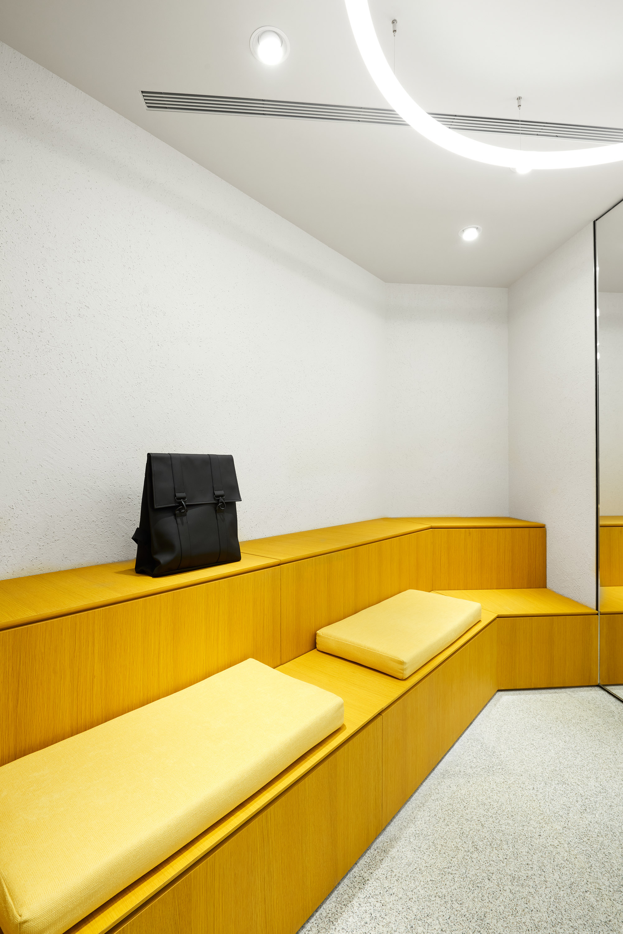
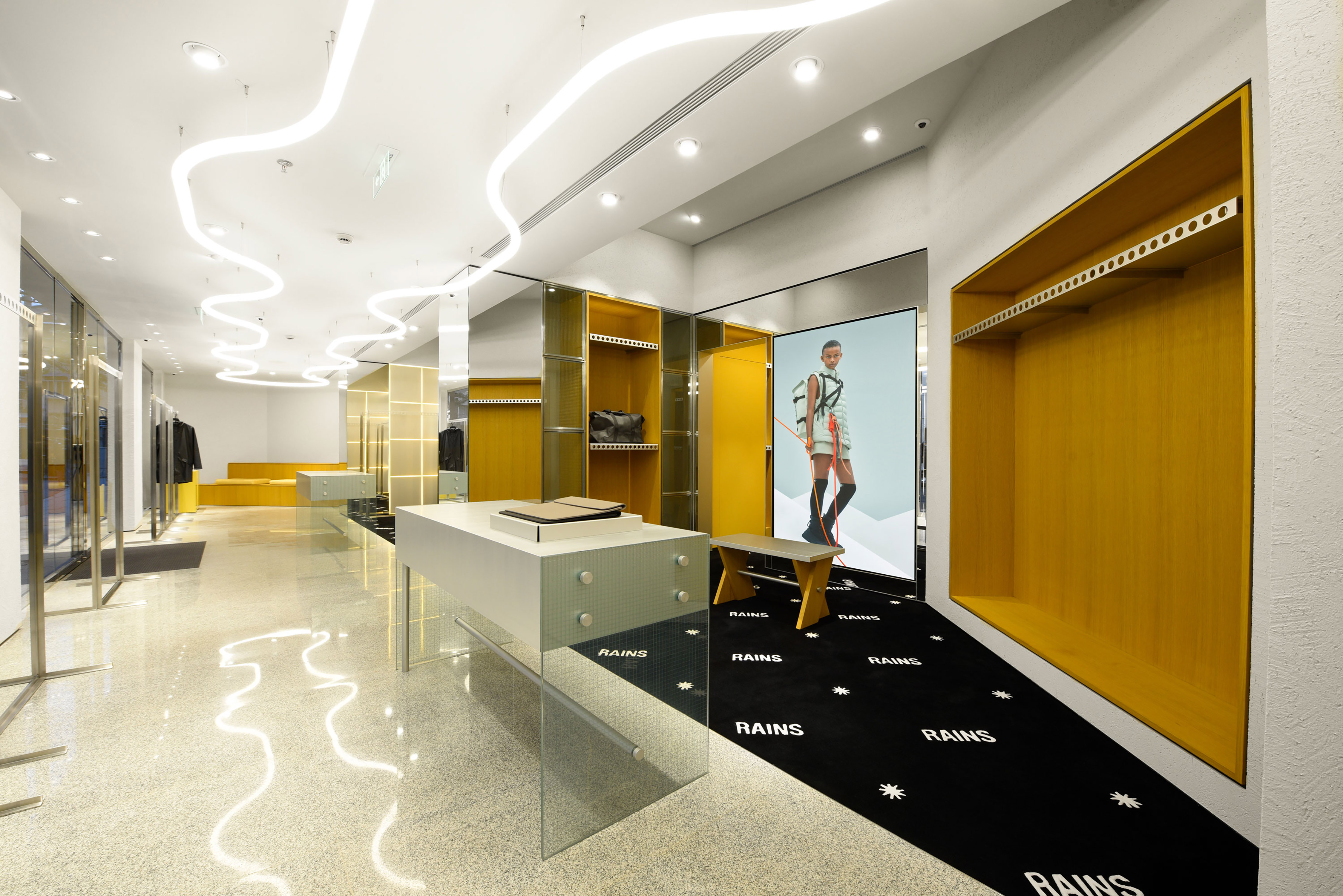
The store plays on friction—between texture, temperature, and tone. Every surface reinforces the brand’s philosophy of modern, intelligent utility. Granite Flooring – Solid and grounded, setting a tactile foundation. Aluminum Cladding – Industrial and reflective, echoing Shanghai’s speed. Yellow-Stained Oak – A nod to construction sites, softened and reinterpreted. Armored Glass Counters – Transparent, minimal, and architectural.
Innovation & Technique
Lighting becomes narrative. A single neon tube runs the length of the store, like a line drawn through space: Light as Liquid – The glow bounces between metal, glass, and granite, animating the interior. Built-In Fixtures – Seamless joinery in oak blends utility with warmth. Function as Form – Every surface, junction, and material serves both purpose and aesthetic.
The Experience
Walking through Rains Shanghai feels like entering a different frequency—cold surfaces, warm light, and quiet precision. It’s not trying to feel like home. It’s built for the elements, just like the brand itself.