RAINS – Shanghai
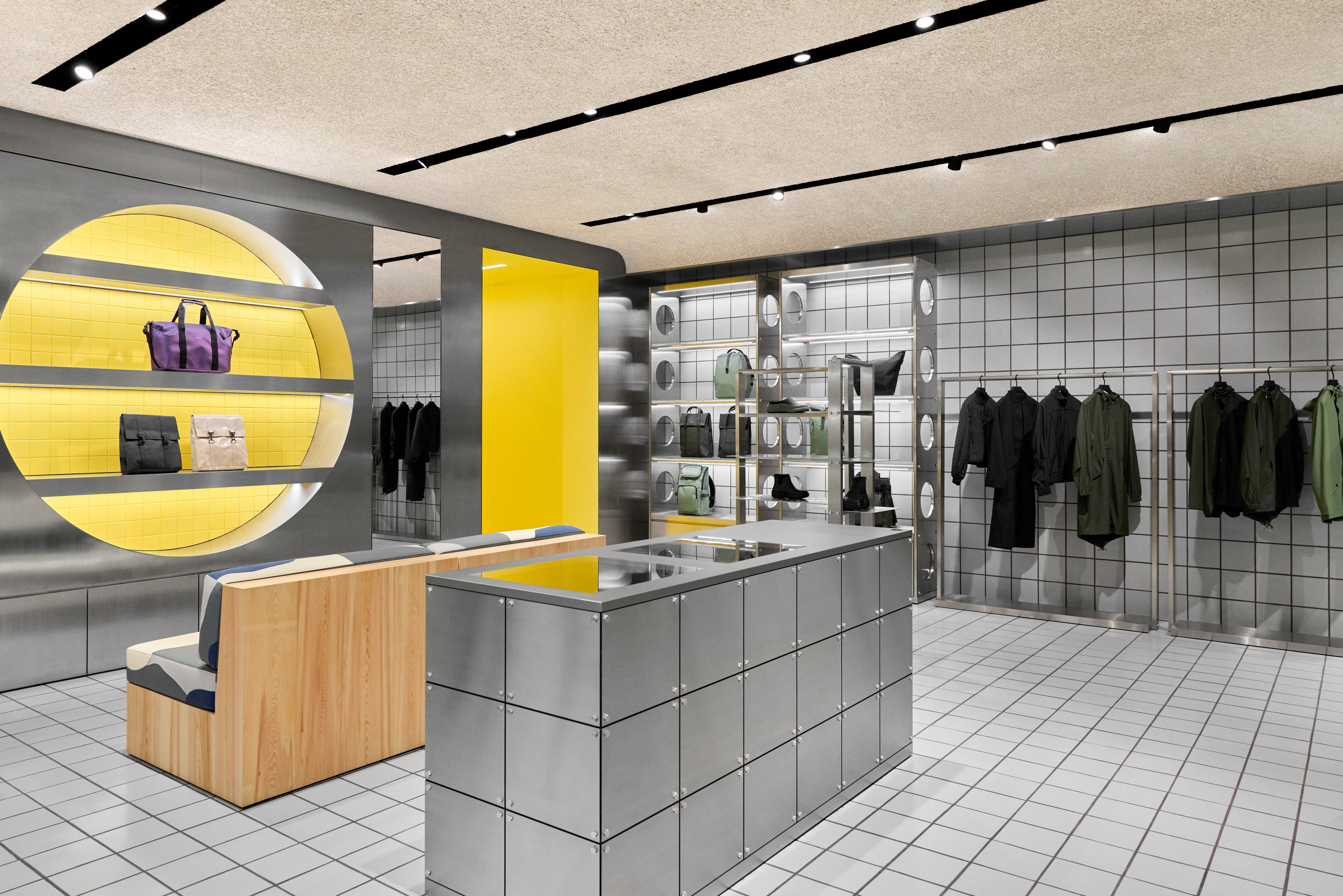
With Shanghai, we rolled out another iteration of the RAINS global retail concept – this time within a second-floor space in the Tai koo Hui mall in Shanghai. Relying on a system we’ve been developing across locations, the project builds on a clear architectural language – tiles, grid, and repetition – while bringing it into sharper focus. Controlled framing, symmetry, and a very deliberate frontality don’t just expand the concept, but concentrate it.
Brief
Following New York and Amsterdam, Shanghai continues the evolution of a concept designed to adapt. Working within a tight timeframe, the project required precision rather than reinvention. We approached it through calibration: elements already central to the RAINS concept were carried forward and refined, while the overall system becomes more enclosed, more symmetrical, and more clearly defined.
Architecture & Design
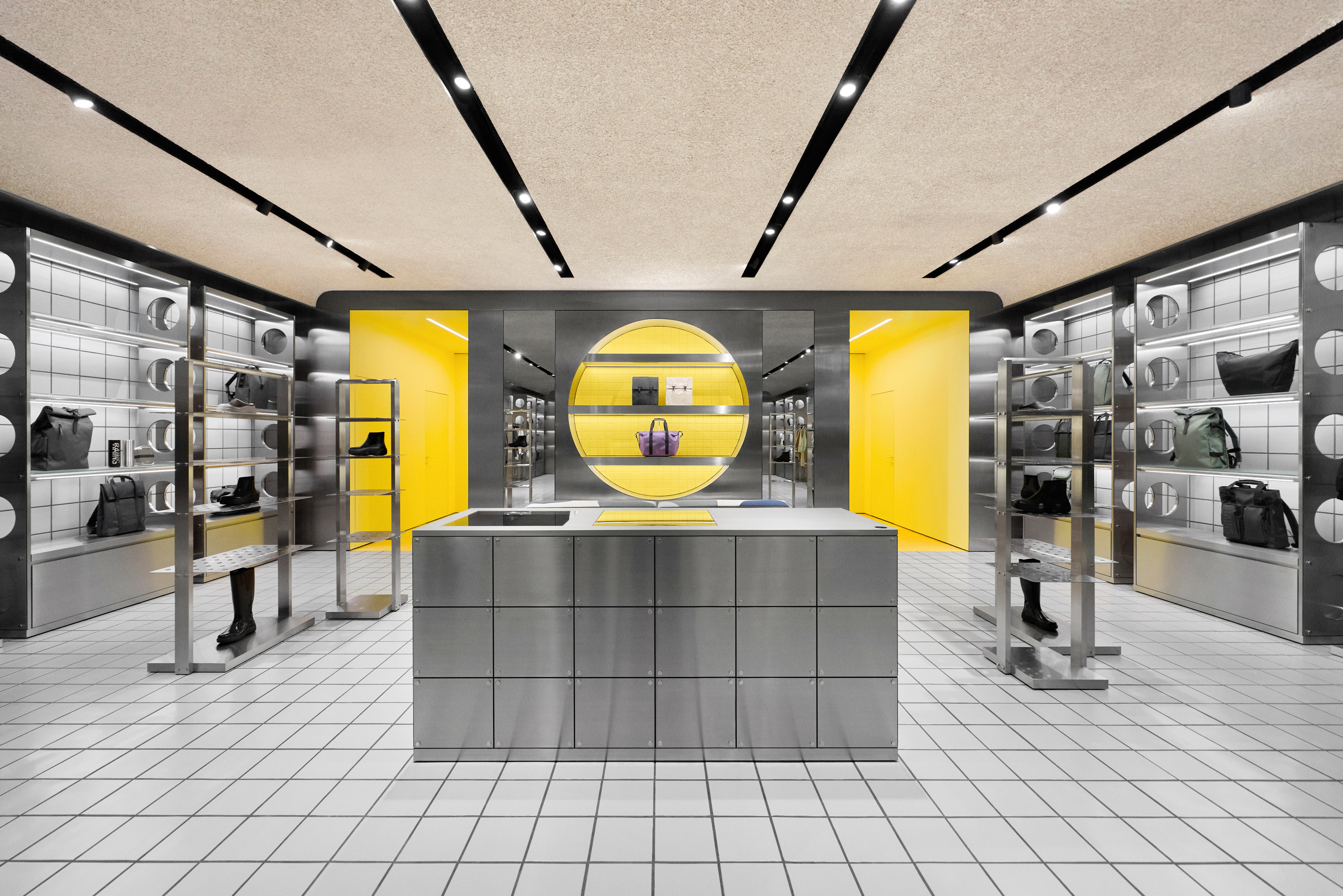
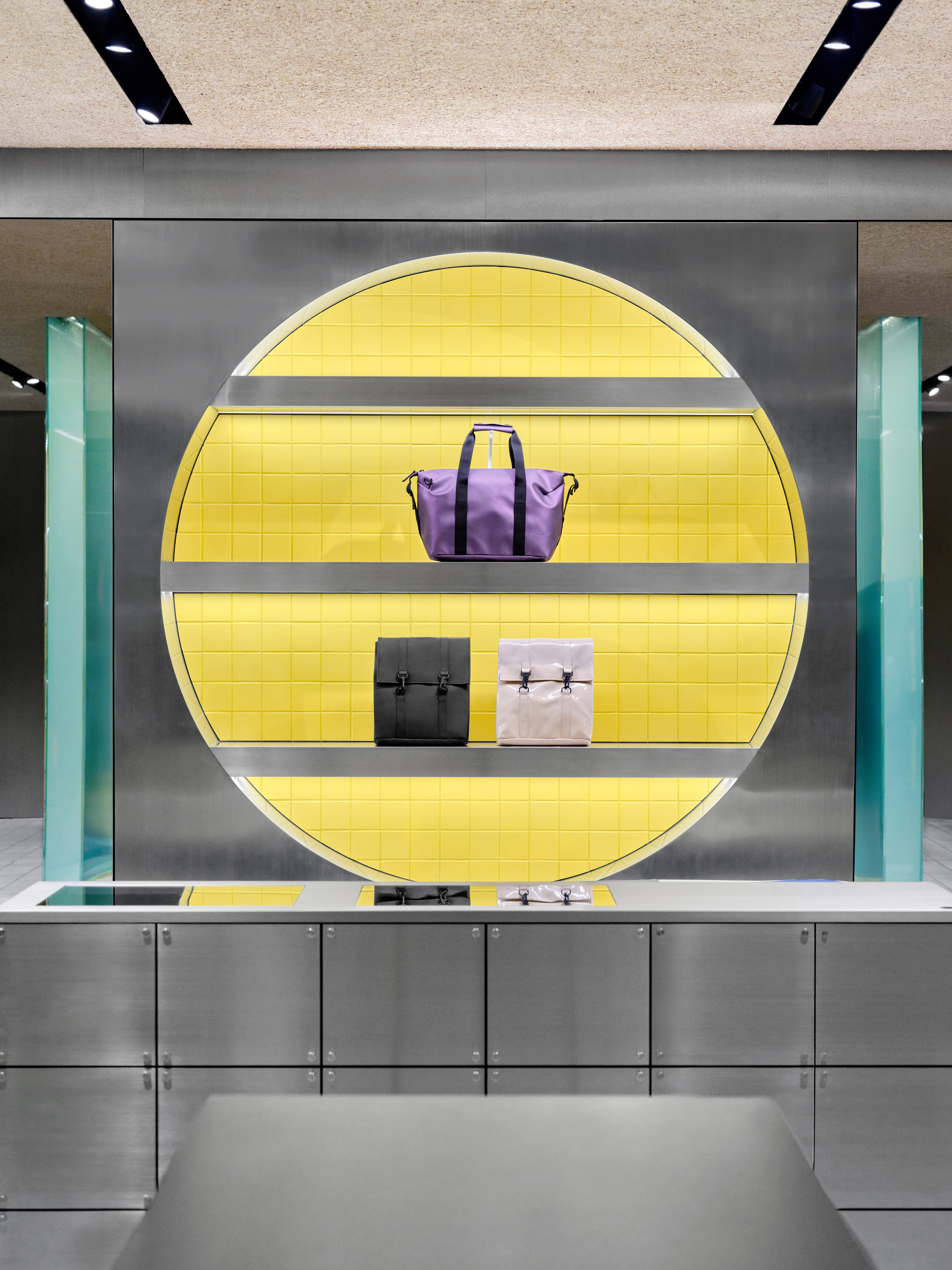
Framed Symmetry
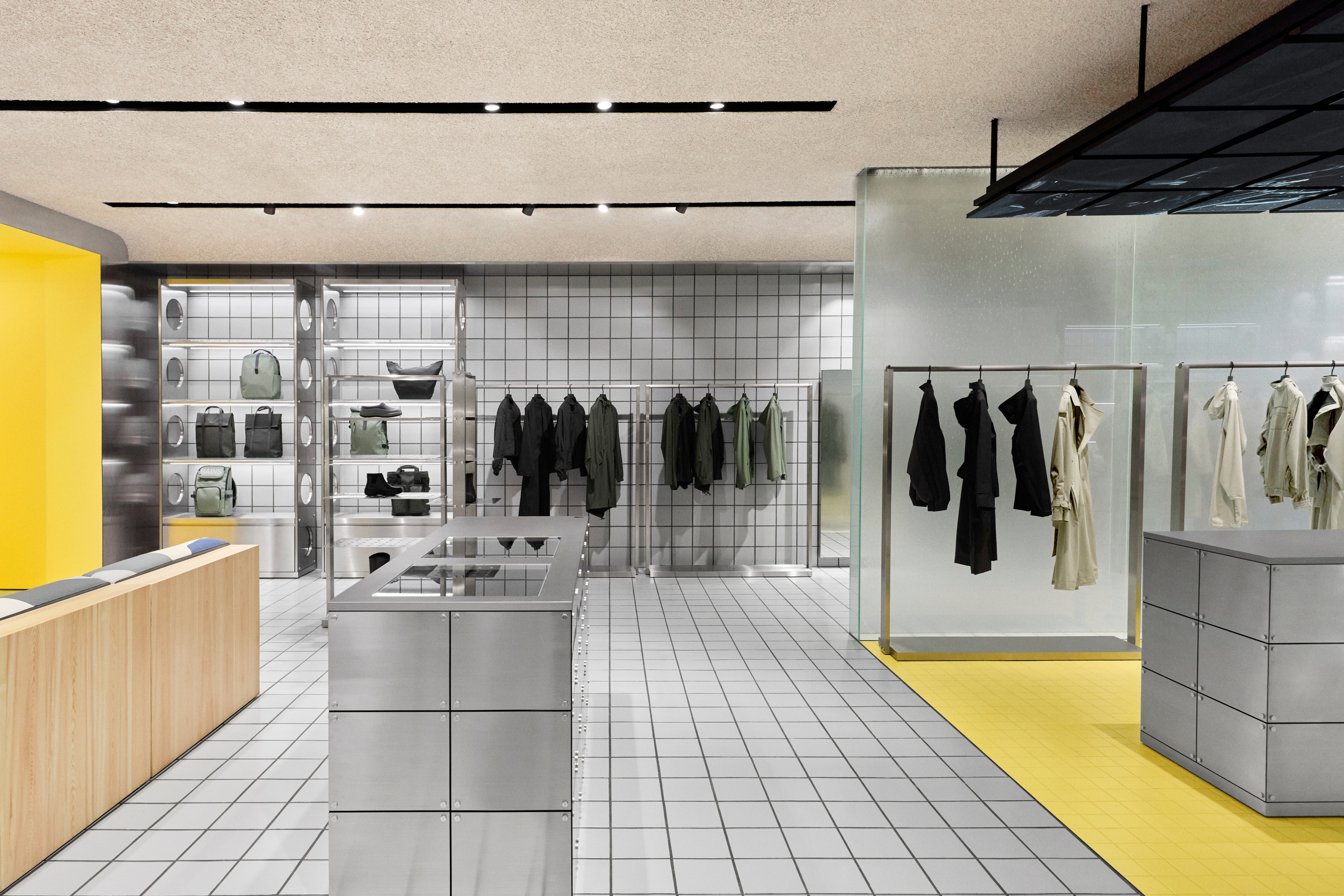
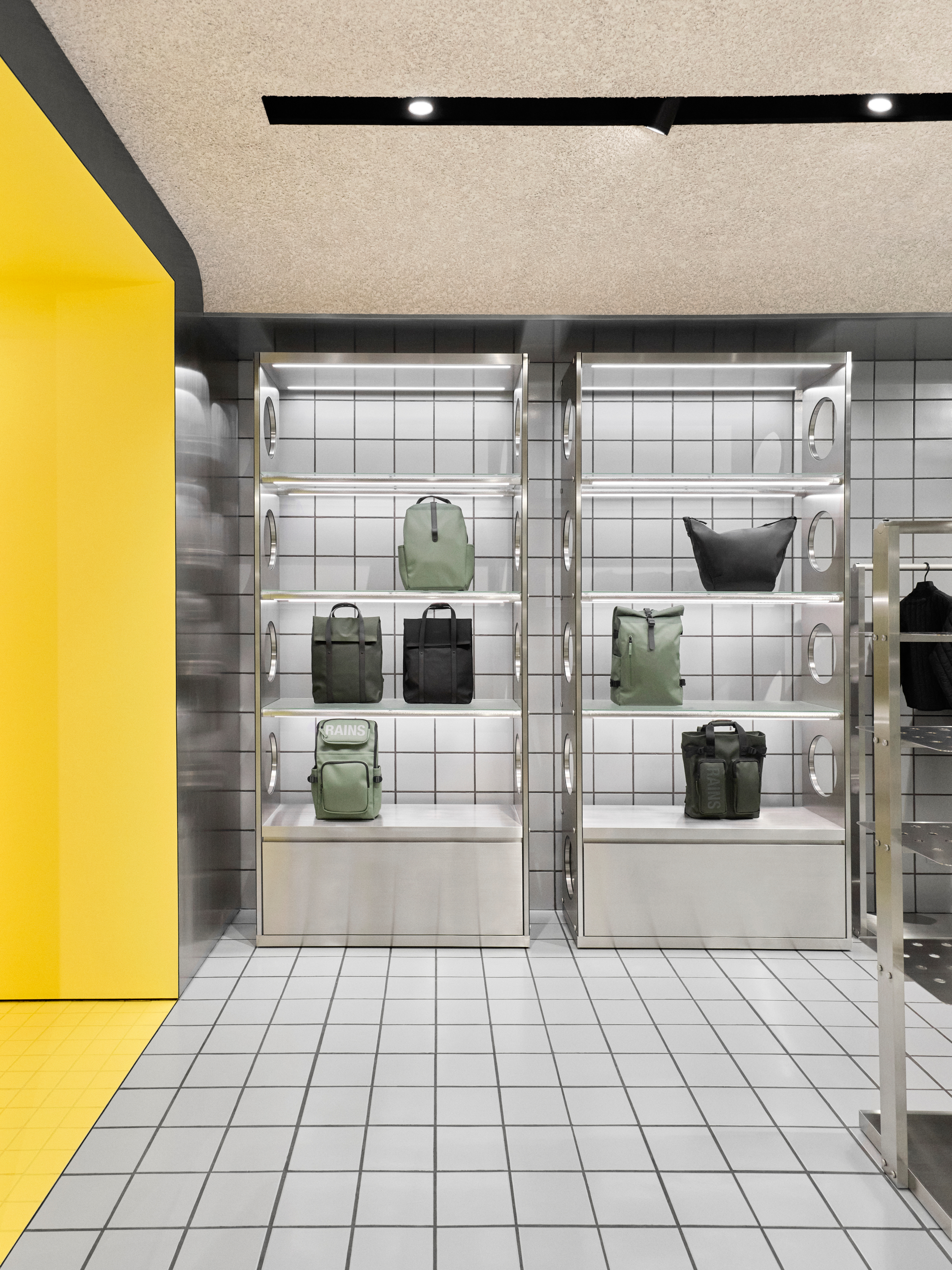
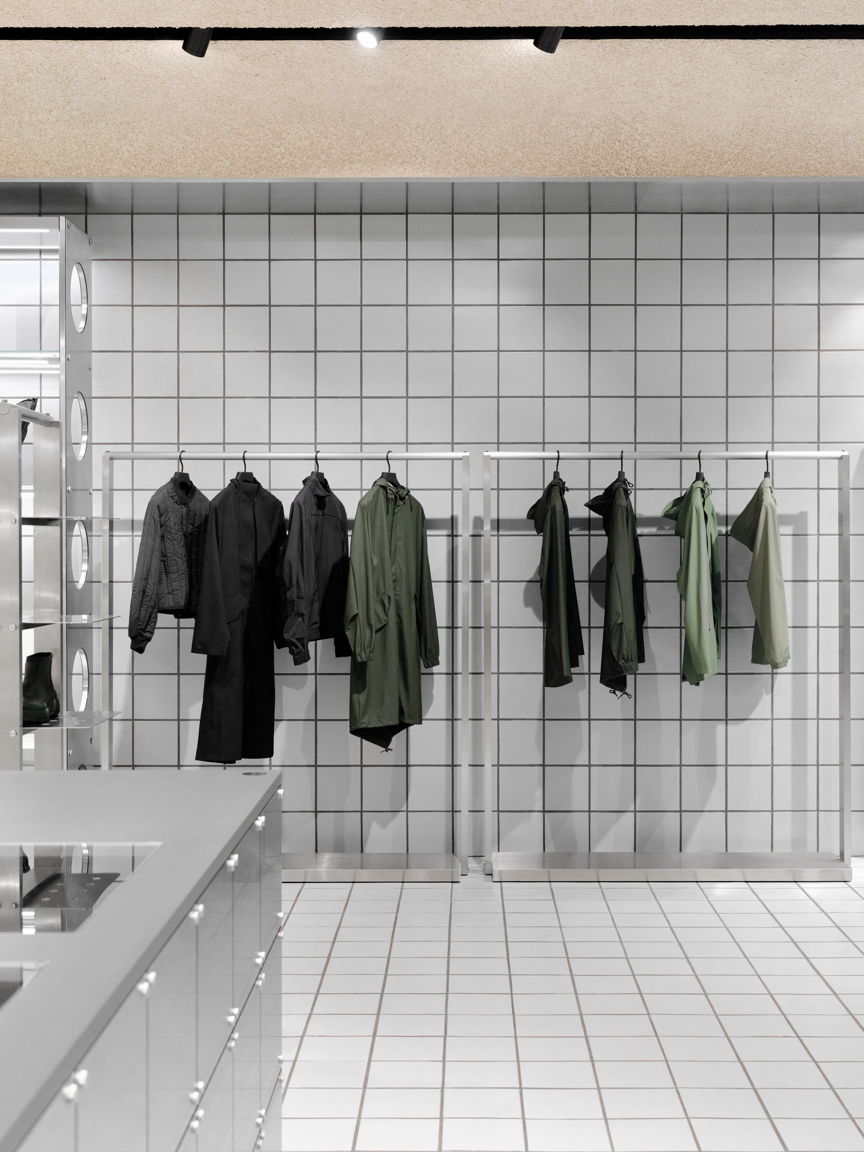
The store is conceived as a highly controlled composition, fully legible from the storefront, yet unfolding gradually in its layers. A central axis organises the space, drawing the eye inward toward a focal display, while symmetrical shelving and mirrored elements reinforce balance – a space that reads in a single glance, yet invites exploration.
Portal & Layering
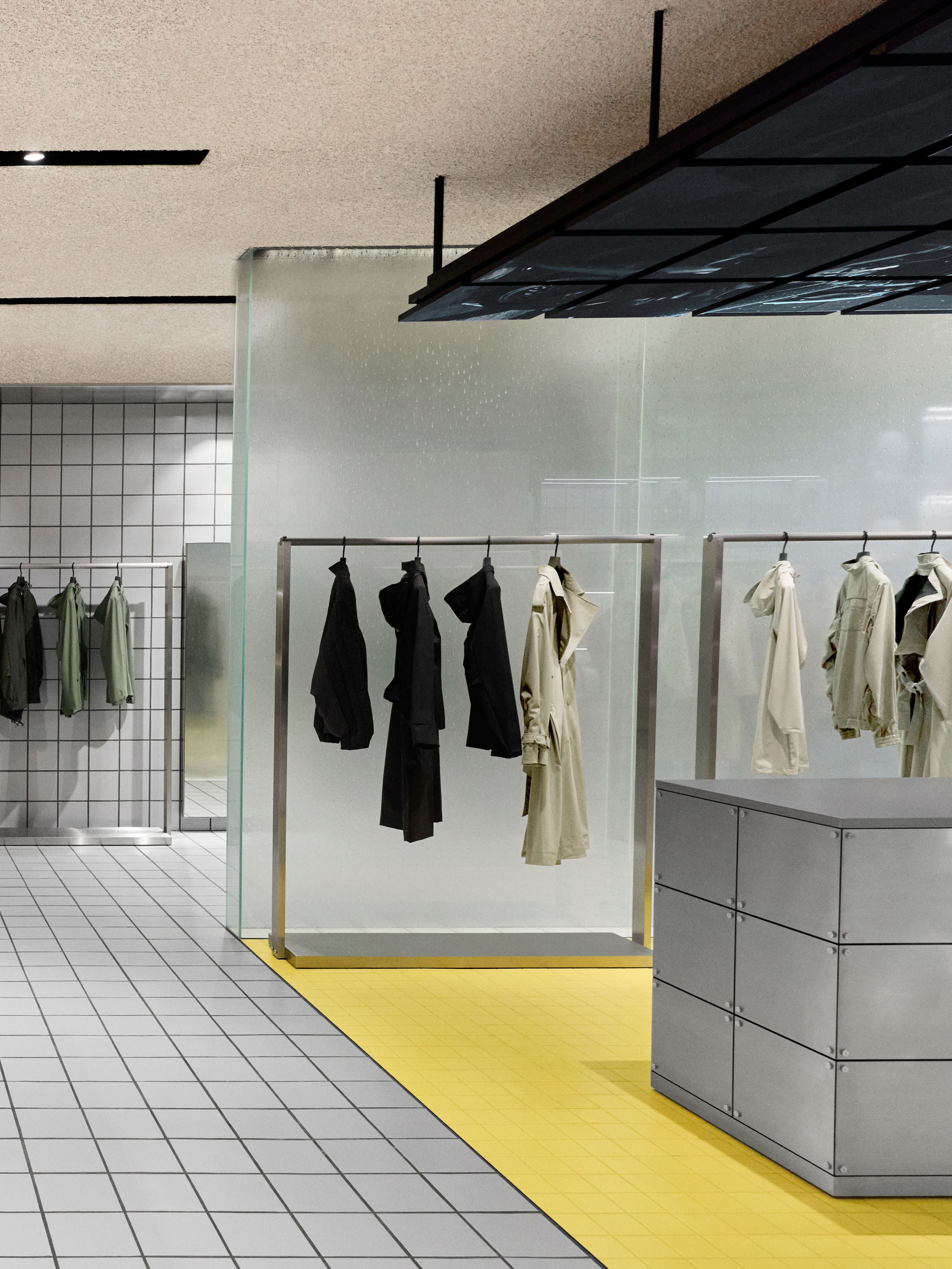
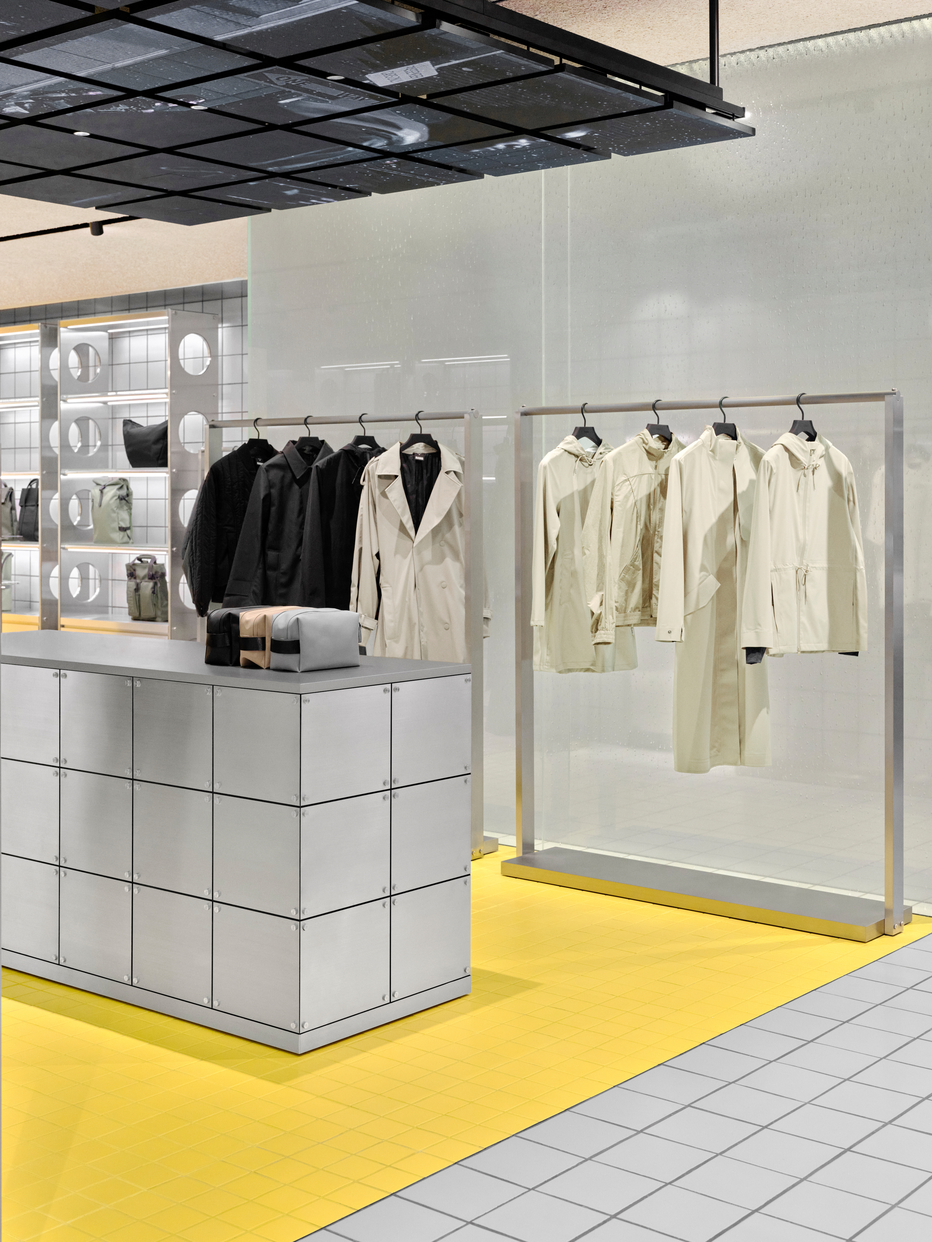
A dark, tiled façade frames the entrance as a defined threshold – almost portal-like in its presence. Beyond it, a foggy glass enclosure introduces a layered interior condition – partially obscuring and revealing, it filters the space, creating a “room within a room” that adds structure to the layout while preserving openness and visual continuity.
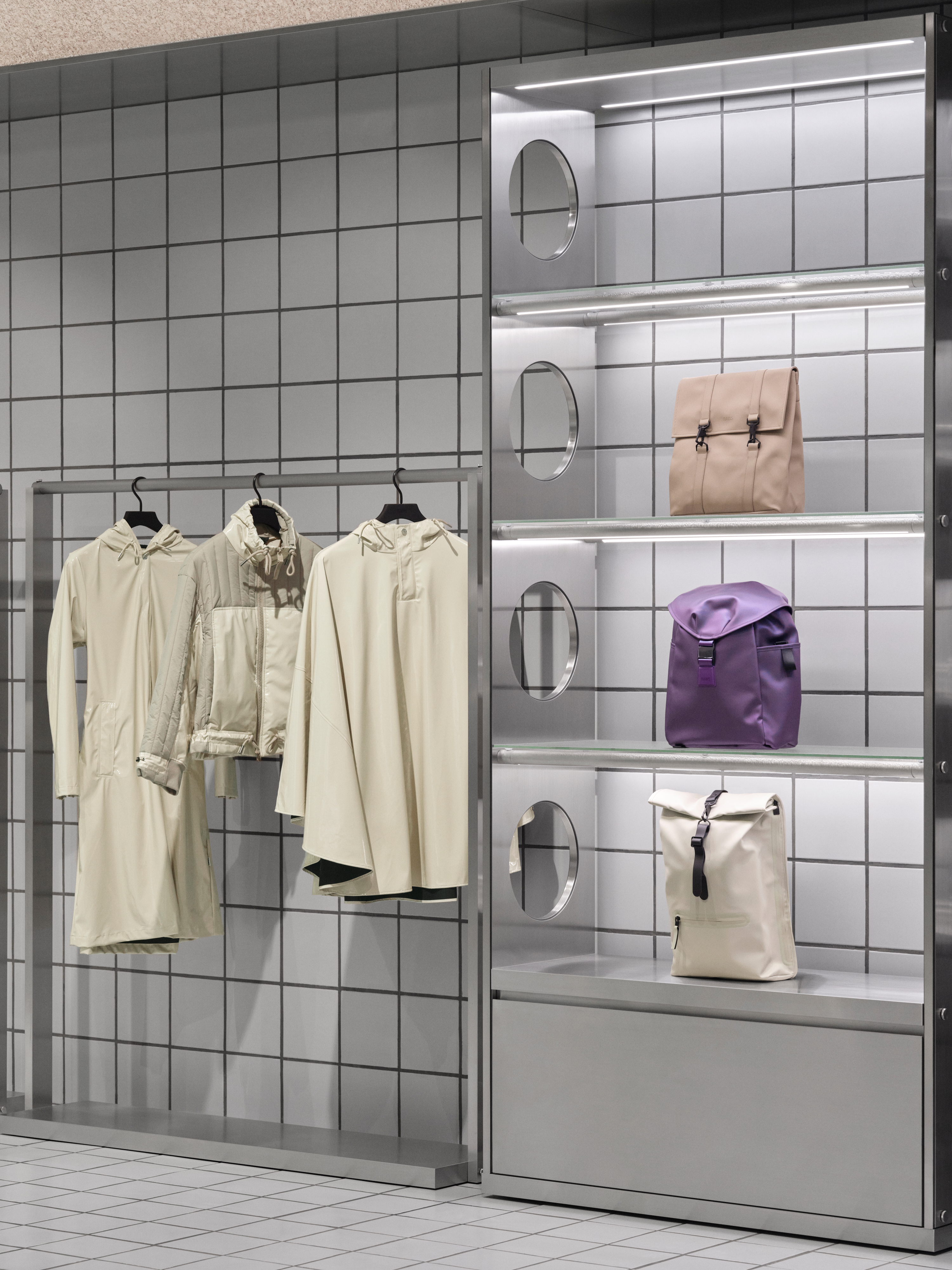
The Grid, Continued
The RAINS grid remains the backbone of the concept. In Shanghai, it extends beyond the floor, climbing into the vertical plane as tiled surfaces wrap walls as well as ground. The façade is clad in the same tiles first used in Amsterdam, creating a direct link between iterations and carrying the concept visibly from one location to the next.
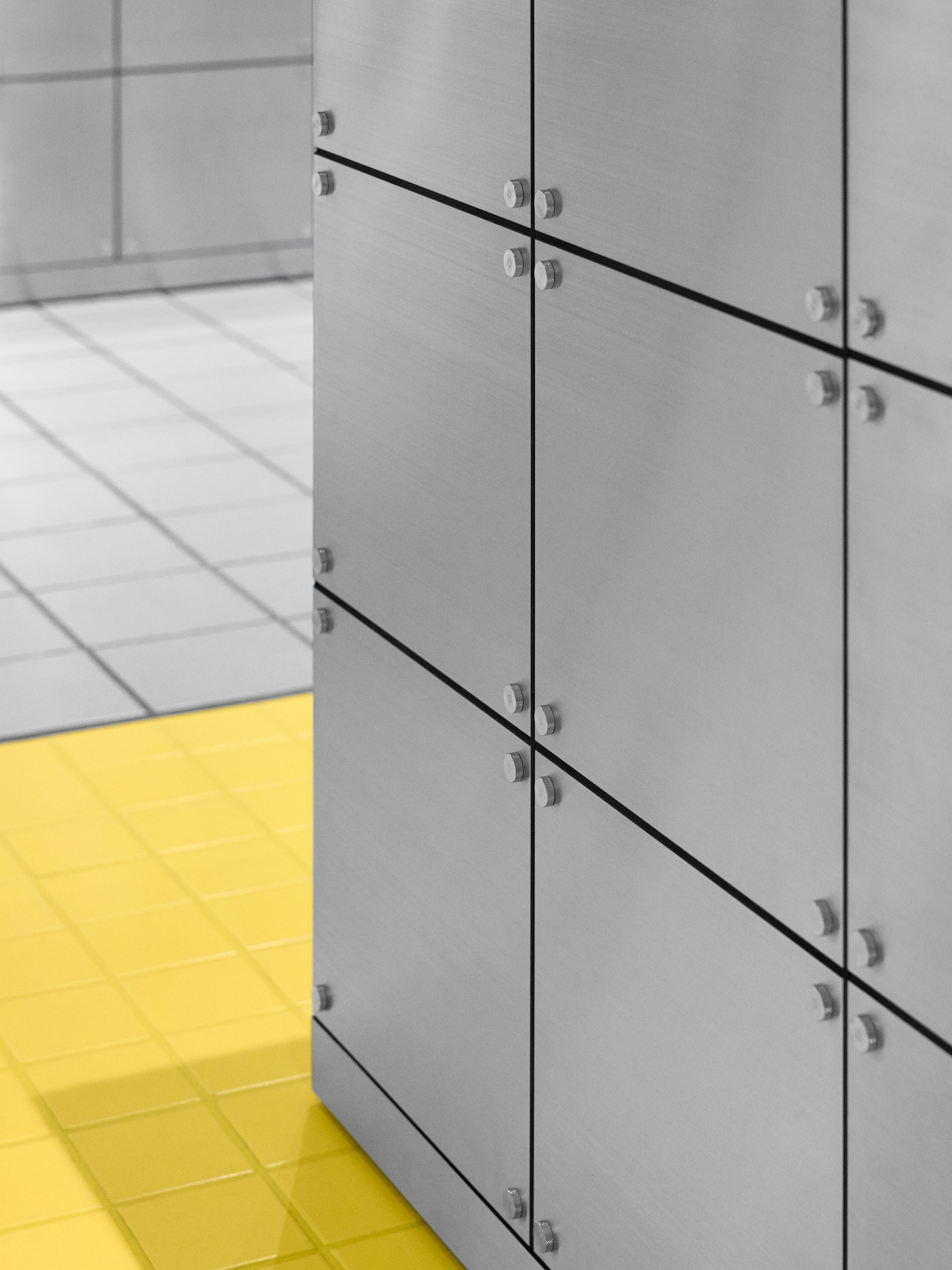
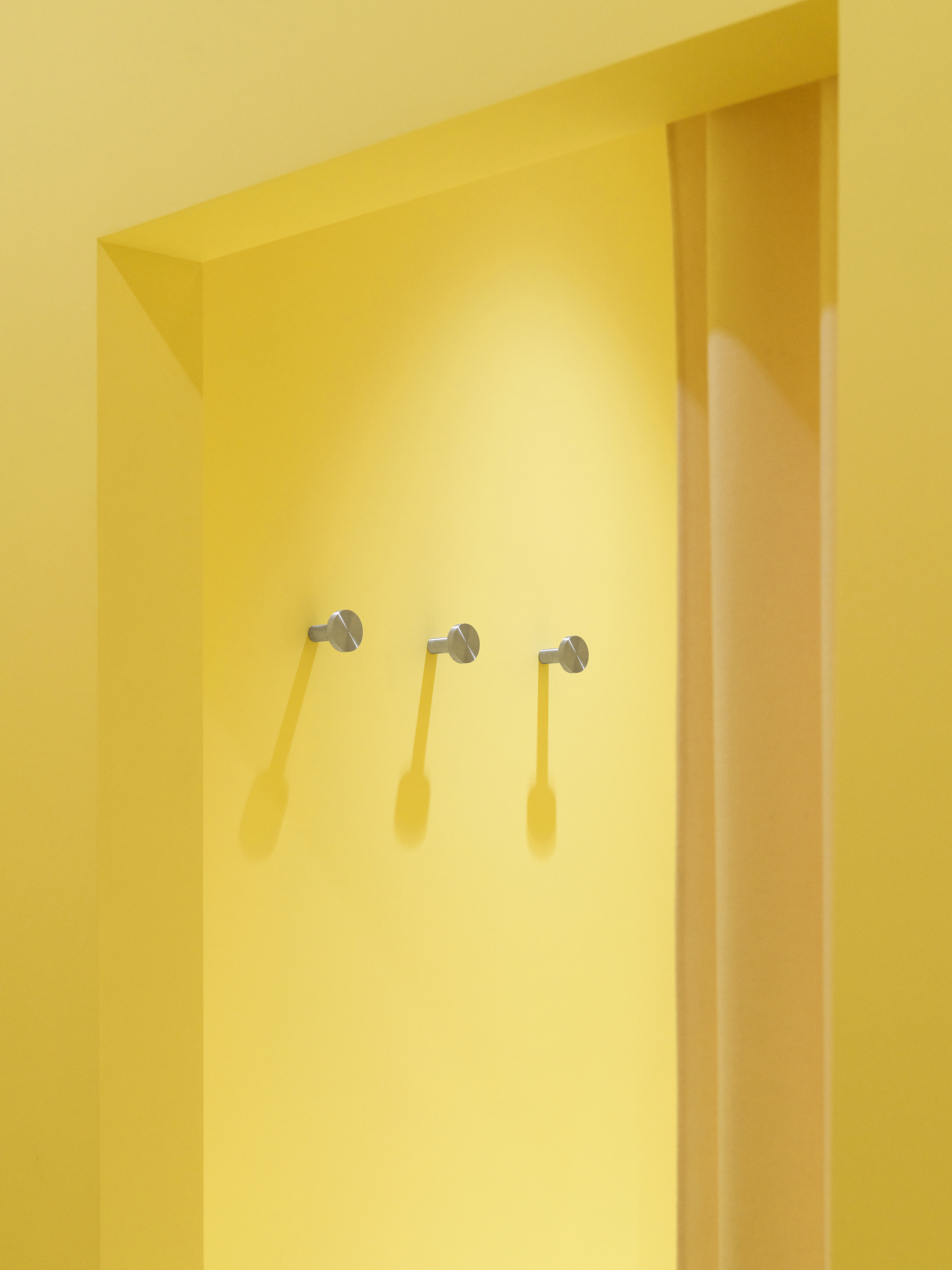
Yellow as Accent
A central shift in tile scale and colour introduces a new visual division within the store. Yellow 10×10 tiles replace the grey 20×20 grid in key areas, creating hierarchy and marking transitions in the space. The move is new within the system, but the colour itself reaches back to the brand’s roots: once dominant in RAINS garments, yellow returns here as a controlled accent within a cooler environment, guiding the experience as it unfolds. Toward the back, a yellow corridor leads into a more private fitting area, shifting the atmosphere to make the act of trying on clothes feel more personal.
The Experience
The store unfolds in a clear sequence – moving from open and legible to more enclosed and intimate, inviting a slower reading.
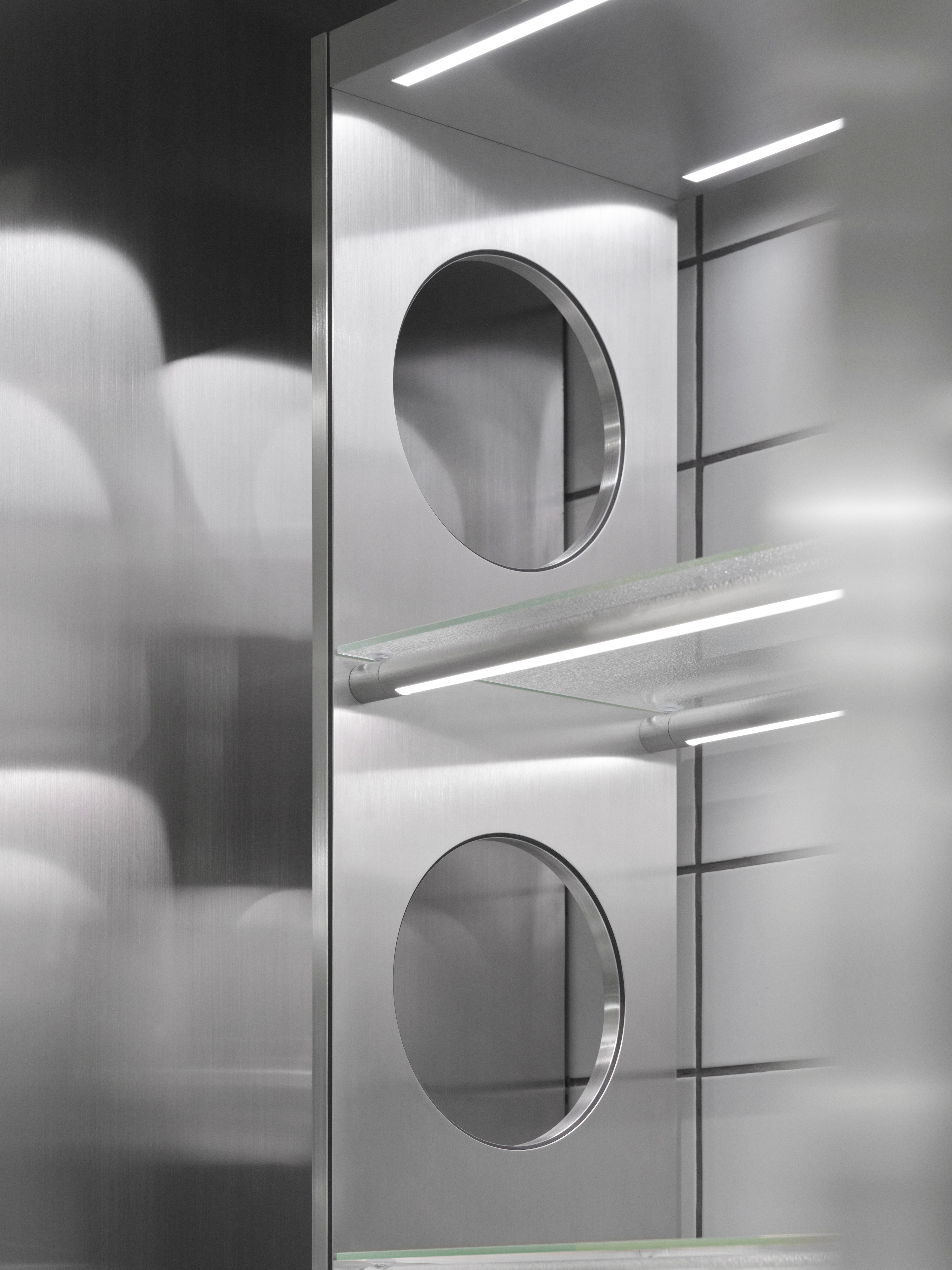
Recognisable elements – stainless steel fixtures, foggy glass, tiled surfaces, and softer finishes – work in deliberate contrast, balancing industrial precision with diffusion and atmosphere. A tension between clarity and softness that reflects the brand’s balance of function, adaptability, and technical mastery, set within a framework that invites the experience to linger.