Parajumpers – New York | A high-functioning heritage brand meets an energized new audience.
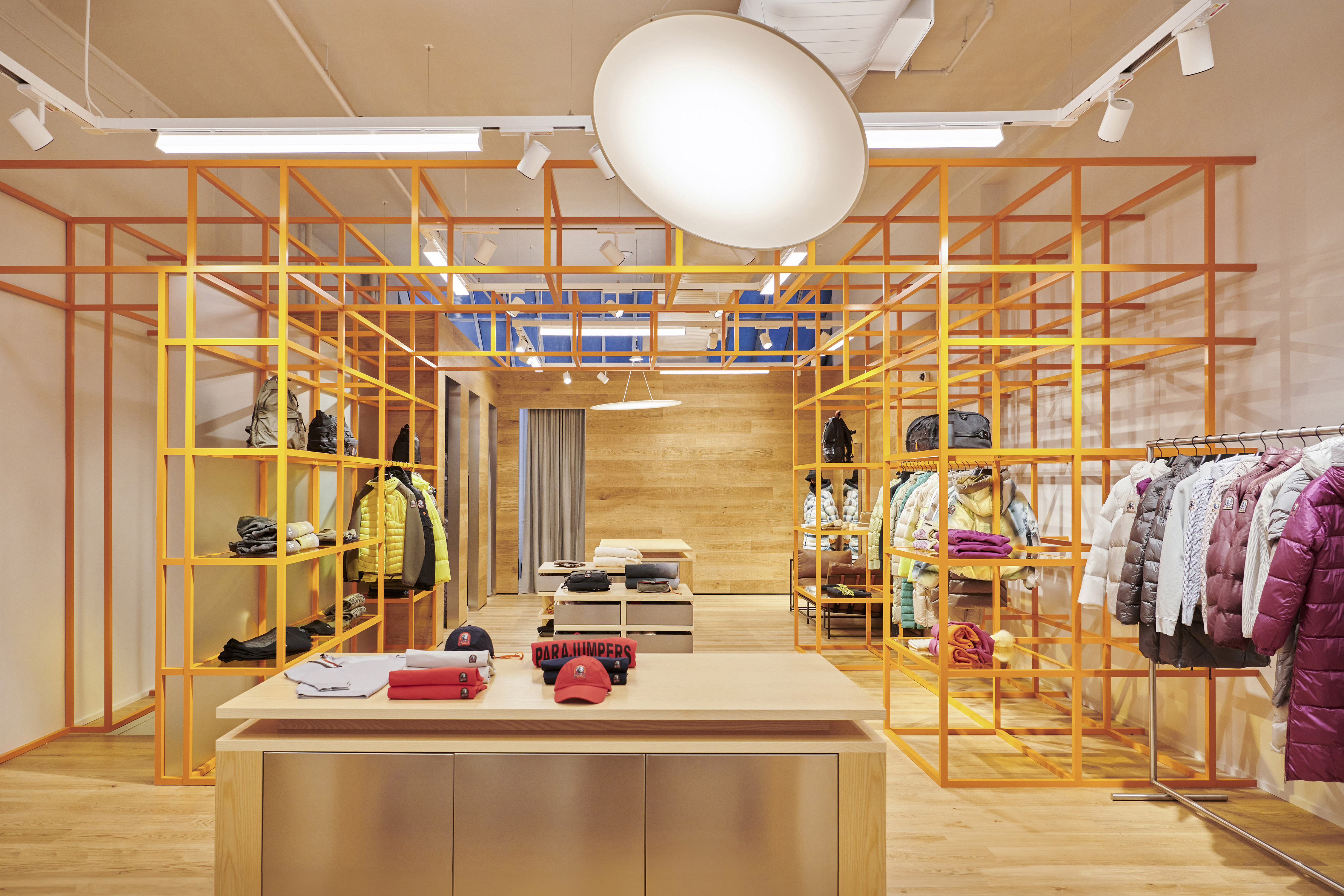
We designed the Parajumpers New York store to bridge the brand’s Northern Italian roots with its expanding global reach. Classic materials—wood, steel, and warmth—meet bold graphics and an architectural structure that acts as both display and symbol: a cage, a compass, a call to adventure. From the signature orange accents to the zigzagging geometry of the central structure, everything here speaks to the gearhead and the explorer alike through retail design that doesn’t just hold product—it provokes movement.
Brief
Founded in Northern Italy and known for its premium materials and manufacturing, Parajumpers needed a space that honored its reputation while pushing it into new terrain. The New York store had to speak to longtime fans and first-time visitors alike, evolving the brand image into something more expressive, more intrepid.
Our task? Make it functional. Make it bold. Make it feel like stepping into a new kind of basecamp—one where every detail nudges you to keep going.
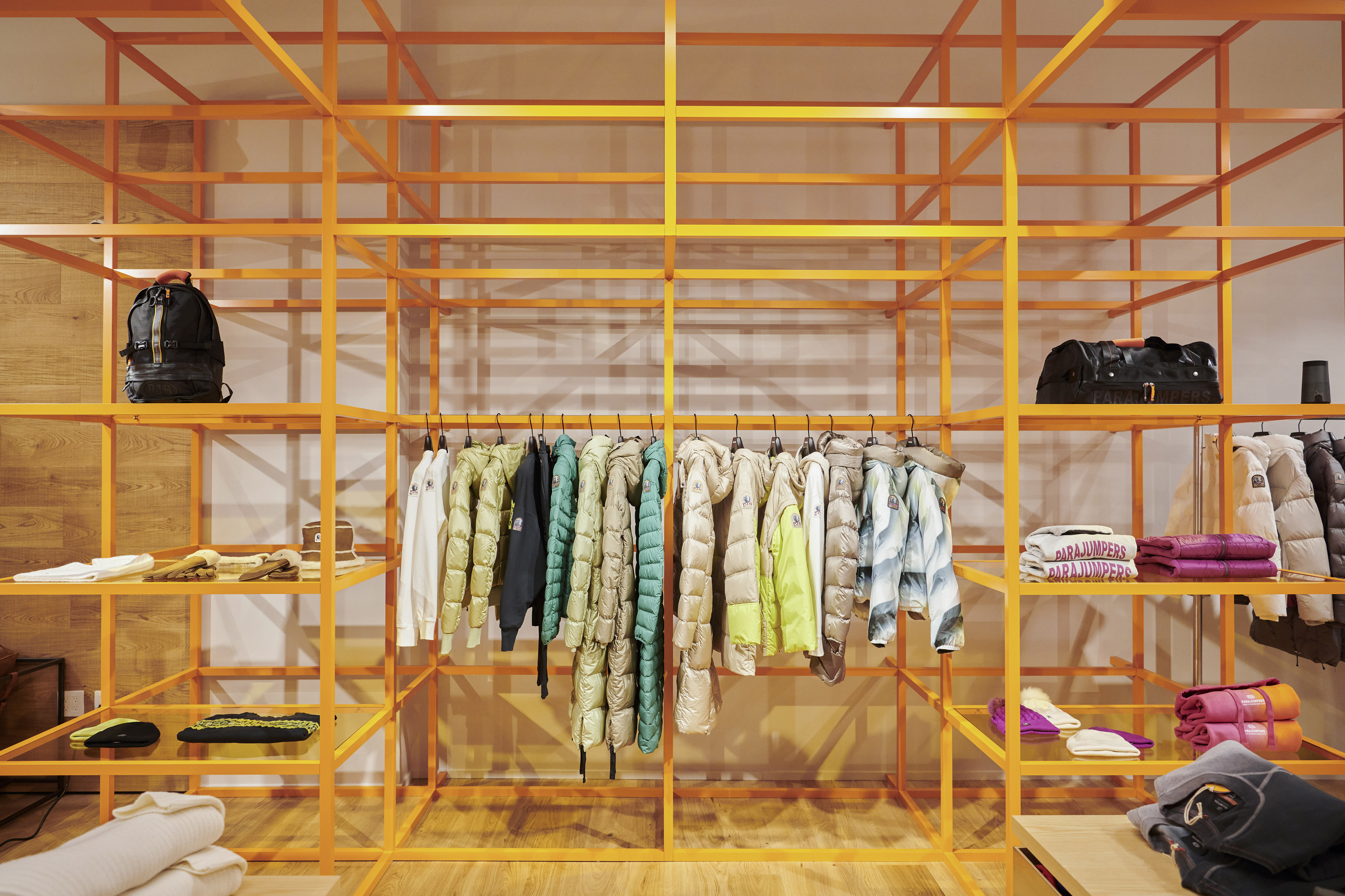
Architecture & Design
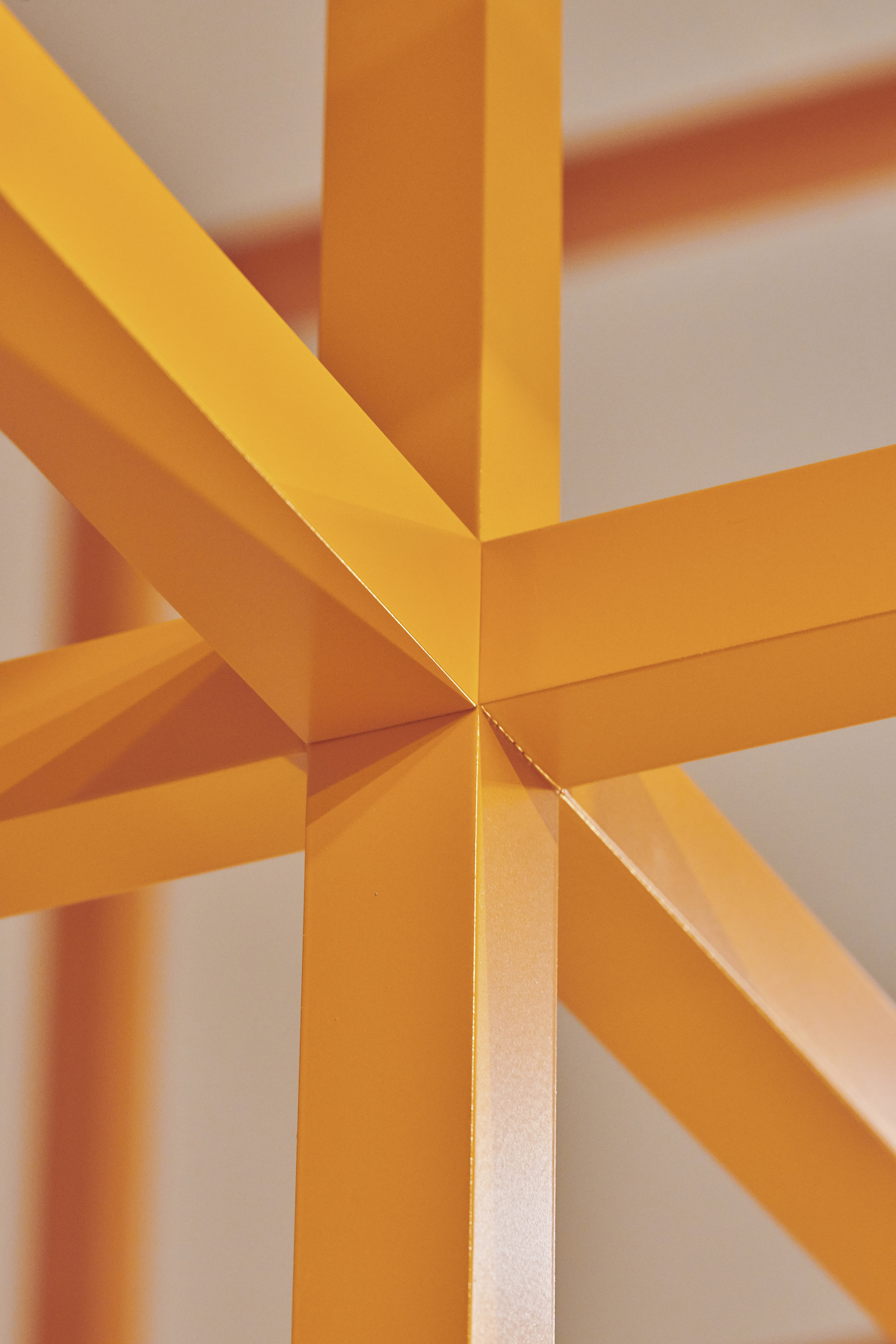
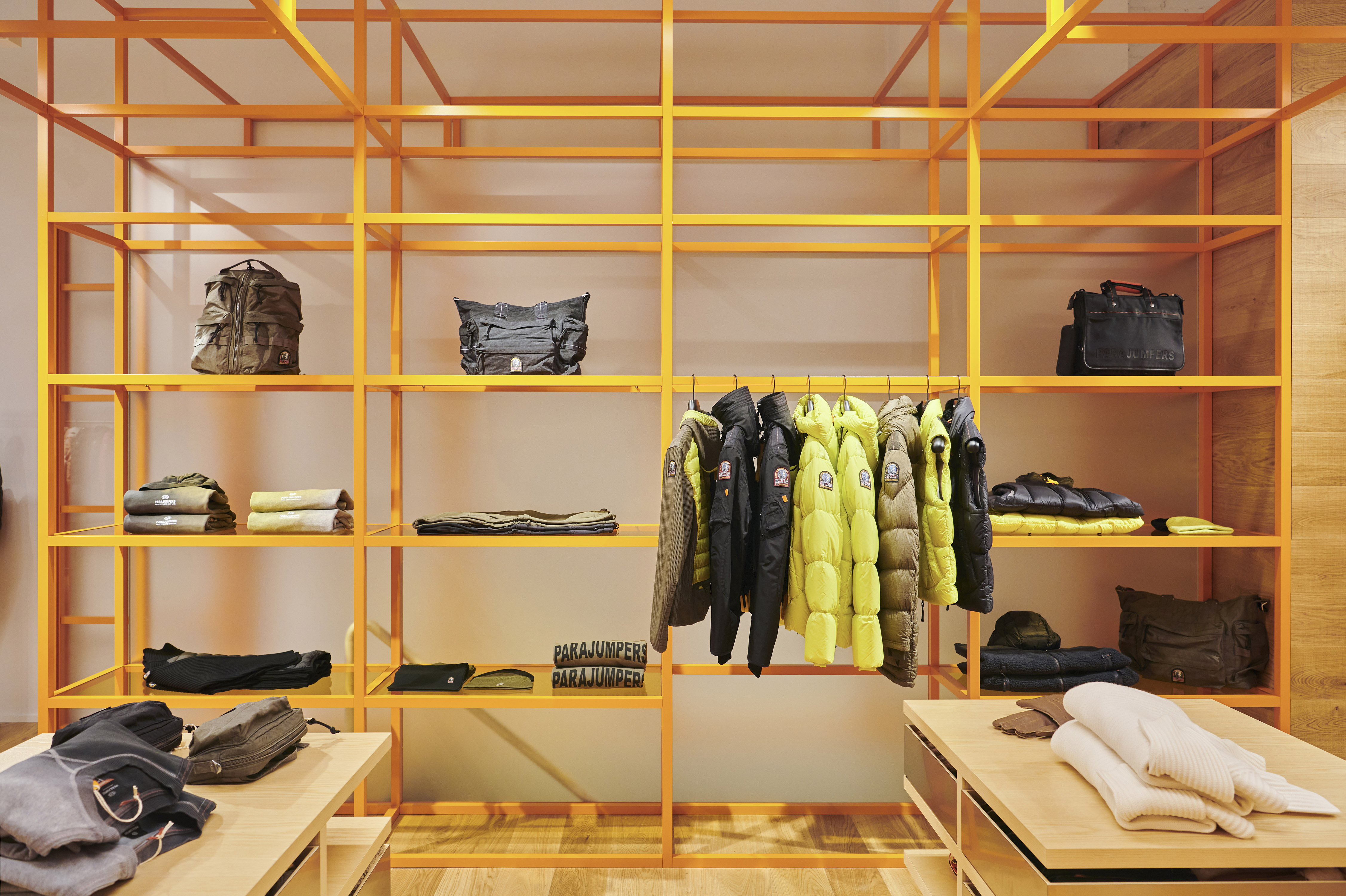
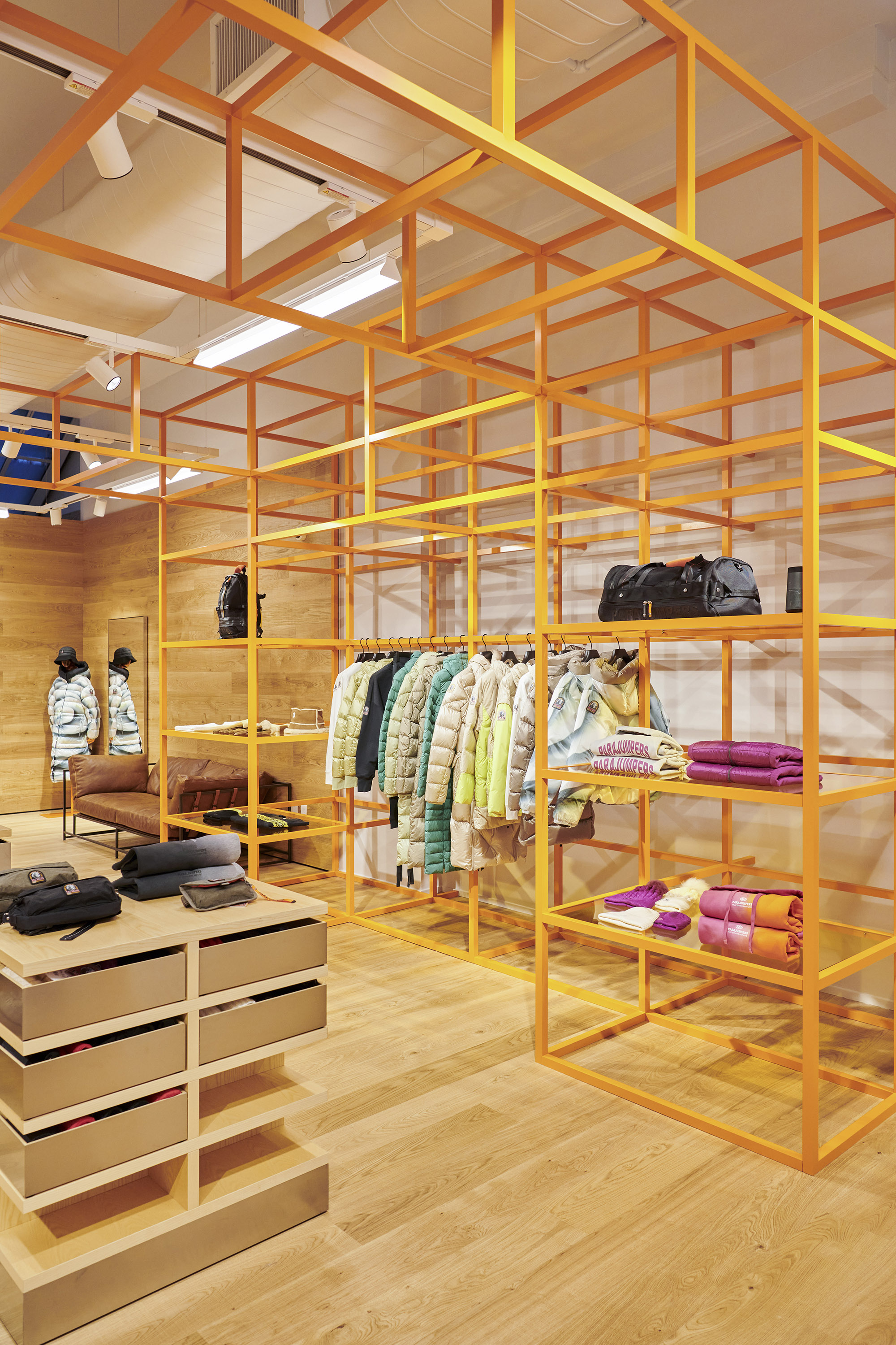
The centerpiece is a bespoke display structure—part cage, part sculpture—crafted in powder-coated steel. Referencing both Donald Judd minimalism and mountaintop ski shelters, it divides the space into three zones: the street-facing product showcase, a mid-section for browsing, and a back zone for fitting rooms and the cash desk. Warm wood cladding brings tactility. Signature orange hits inject identity. And the whole system feels like it’s in motion—zigzagging like ski tracks, reaching like sunbeams. Light, open, and modular, it’s a framework that can adapt, evolve, and expand over time. Because adventure doesn’t wait.